Friday, 16 November 2012

Final project


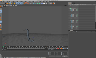
Screenshots of final project modelling work. 


First thing I did was start off with making the body. I used a technique called metaballing. This is when you add a shape and then another shape next to it and when you add the metaball it merges them together. I used two spheres to make this body I changed there size and position to fit the picture bellow. Using metaballing is more limited then I expected it to be. For example if I put two cubes together and added them to a metaball it transforms them into circle shapes and then it looks the same as if I had added two spheres. So that wasn't what I was expecting... now this means I can only do a certain number of things using this technique.


The second thing I did was trying to figure out how to do the tail. It was long and at the end it was more spiky. I didn't know how to do this. I knew how to make a simple tail using the ... extrude tool but didn't know how to add spikes. I tried extruding sections of the tail but it didn't bend the right way. Before when I was messing around with the different tools I used the ... extrude tool on a circle and it made a big spiky ball. It reminded me of one of my other characters. She had something like that at the end of her tail. So I deiced to use it for this character (for now) as in its species there are many different feature among them.
For the tail itself it added a cube inside the back of the body so you couldn't see it. Then I used the same extrude tool I used on the spiky bit (on the end of the tail) to create what you see in the picture below.  


This is the original body and head before I added the teeth and gap for the mouth. 


So then I decided to add the small spines on its back. I just used the tube shape and placed them all along the back of the body. I changed some of the sizes and rotated them to fit on the back.


Next was adding the teeth to the head. Firstly I had to add a gap in the head for the mouth. I used a cube and transformed it into the shape of a long rectangle then I placed it inside the head shape. I then used the ... tool and this cleared the area where the cube was and it left a gap in the head like a mouth.

Next I had to add teeth inside the mouth. I decided to use cones. I spent ages transforming them to fit inside the top row of the mouth.
Then I did the bottom layer. The picture bellow is a screen shot from underneath the mouth.
Next I had to create the ears I used the same technique for the headphones to do this.
I created a shape and then copied and pasted it a certain number of times to get the right shape for the ears. Once I had done that I used the Loft NURBS tools this joined up all the shapes together.
I then duplicated the ear and pasted it on the other side of the head. I also spent time transforming all the points in the left ear to make it slightly different and not just symmetrical.
Next I needed to give the character legs.
I decided I could do it in the same way as I did the ears. I created lots of circle shapes and placed them in the right place to form a leg shape. I did do this on a separate document before adding it to my model. I made the shape of the leg first before adding the toes. I had a lot of trouble figuring out how to add the toes on. First I tried adding the toes all separately from the leg but this didn't really look very good. All the shapes were fine but where they joined up didn't look very good. So I tried to continue modelling the leg and by adding a toe on from it. I did this by adding more circles and shaping them into a toes then I added them into the Loft NURBS that the leg was in. 
This created one toe attached to the leg. But I couldn't make another toe in the same Loft NURBS it didn't work when I tried. So instead I decided to copy the original leg and paste it over the one with the toe. I made this one slightly bigger so as you couldn't see the other leg. Then I created the toe on the other side of the foot.
Now all that was missing was the middle toe. I did the same thing as before to make it.
Bellow is a Birdseye view of the model so far.
This is a shot from bellow. I think this is my favourite position of the model at the moment.
Final a side view of the model. Next I need to do the front legs.
Underneath is a quick practise with colour on the model.

I started on making the front legs. I used the same technique for the back legs to make the front.


So first I made circles in the shape of the leg. Then I added loft NURBS to it. 


The front two arm/legs are different to the back legs so I had to model them in different position. The back legs are a lot thicker and a different shape so I had to make it a different shape.   


This is the right leg done.
I had to make the left leg from scratch though because it was at a slightly different angle. 
I then transformed the legs to the right size and placed them on to the model.
The last thing I needed to do was create a background. I started by adding a landscape and transforming it to the right size. Then I rotated the character so it would be standing on a hill. I wanted it to be a sandy floor because the planet the creature lives on is quite sandy. So I added a new material and I added a brown colour to it then I selected bump on the material. I chose the texture as earth then I fiddled with the properties. I then added this material to the landscape.  
The landscape looked good however it wasn't across all of the ground and it looked like it just ended suddenly. So I also added a floor with the same material on it. When I looked in render view it was spread across the whole floor.

Next I needed a sky so I went to the light options and added a sky to the background. Once I had done this I could add a colour to it. I selected cloud from the material list and after I had changed the colour to a lighter blue and the cloud consistency I added it to the sky. 

I added a planet in the sky to make it look like the creature is not from earth. I added a material to it and placed it in the distance on the sky.

The last thing I added was the lighting. I placed a general light object and placed one above him which gave him a shadow and another to the side so you can clearly see the creature.


Tuesday, 6 November 2012

My character for 3d model

 This is a early version of the character I would like to change into a 3d model. This is a drawing on Flash and one that I used in a previous game story unit. This is the main villain's species in the series. They are called the Ashi.
   
This is the coloured version of my character so I know all the colours on it.

This is the attempted drawing of the back view of the character.
The front view. I tried to show on all drawings that the left front leg is slightly bent and the other front one is straight. I tried to imagine how it would look from all angles.
The side drawing below is a bit wrong because the head should be smaller like on the coloured one. It will look the same on the right side apart from the front legs being oposite.


After starting to model. I found it quite difficult to model the mouth open and the tail is also proving quite hard to do. So I found myself changing parts of the character. This doesn't effect my character concept as the creature is from a species called the ashi and they don't all look the same. In my game design unit there were a few ashi in a scene and they all looked a bit different. Some had different tails others had lighter purple skin colour and some had spiky spines ect... 
So when modelling I changed a few things and then drew it again to see how it looks in drawing now.

I haven't added the legs yet as I am planing to keep it the same as the other picture but I may need to change that too. I did it's mouth shut as I was having trouble with the shape of the open mouth. I started doing it with just using the top of the mouth but it looked a bit odd so I did a simple head shape and then added the other head inside so the teeth I had started to make stuck out at the sides. This means I had to do the mouth shut but some of the teeth are stuck out so it still looks menacing.  


3D Research

I based this research on the character I would like to produce in 3d. He is a long purple alien looking creature with big teeth, claws and ears. So I looked at a mix of realist alien creatures and more cartoon type creatures. Also they all have a similar feature to my character. I was also looking at a mix of skins and fur to decided what texture to use on mine. These 3d characters all have a similar feature to the one I am making.


Randall from monsters inc has the long body similar to my character. Randall has scaley skin because he is a lizard. I don't know what texture to have for my character although he does have a long lizard like body I'm not sure that this type of skin would fit it. 

My character isn't very similar to alien he is much more cartoony but beacuse it is a well known character and known baddie I wanted to look at it. My character has big teeth like any alien- like creature would have also I quite like the way the alien's skin is... its looks smooth but hard. It might be a possible type for my character but I'm still not certain about it yet. But also now I think my character is a bit closer to an animal then an alien but it's useful to look at both.
Now this is a completly different 3d character. It's a digimon. The reason I'm looking at this one in my research is because like I said my creature looks a bit more animal-like then alien-like. It has a similar head shape and colour. But I was looking at a different skin type again. The digimon looks more fury. I'm not sure if that would be right for my character. It may be more animal-like but I'm not sure if it would fit my character.
This big 3d monster I found has a closer skin type to what I might want. Its just like plain skin texture without fur or scales so this would be the most likley one that I would use. It also has some spines on its back like my character has.

I know this picture isn't 3D but I think this might of inspired me to do a creepy baddie like I did. Watership down always had this odd art style to it and the black rabbit of inle is always a character I remember the look of. A rabbit with red eyes and no pupil I always thought was very disturbing and creepy. So when I look at my characters that I have made for my game project I notice that the baddie has long ears almost like a rabbit and it has pure red eye without any pupils. The black rabbit of inle is like the grim reaper for rabbits and since I always thought it was scary looking (especially the eyes) I think the look of it must of partly inspired some of my characters.   


This 3d model I found is quite a good one to look at for mine. The four legged postion it is in will be similar to how my one stands. So it's useful to look at and how prehaps I may have to slightly extend the legs of mine to make it look right in 3d. Its clawed feet are also a similar feature to my character.

Friday, 14 September 2012

Cinema 4D Work Following lesson tutorials

Shapes

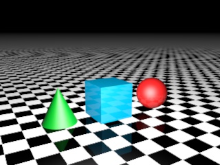
I made this 3D model in cinema 4D. In this program we use many tools to create certain things. It could be scenery, characters or objects. I used the cube, cone and sphere object tools to place the objects on to the stage. Then make sure they are lined up correctly. Next I added the floor to the scene. By selecting objects, scene then floor. Next was adding the colour by creating a new material. Also add a reflection to the colour. Then I added a pattern to the floor. Last I added the light position on.
Ipod

I created this ipod in the cinema 4d program. First I took a cube and then I changed the shape to make it long and thin like an ipod. Then I added a plate shape for the screen and tube for the menu buttons. 

Next I changed the tube to be flat and placed it on the changed cube. 
Next I grouped the layers together and named it ipod. Then I added another plane object for the table underneath the ipod. Next was changing all the colours. I made a new material and made the colour on it red then I added it to the changed cube shape.
 

For the screen picture I had to get a picture of an album I like and add the ipod menu to the other side and then put it on photoshop to get the right size. Then I imported it to a new material and added it to the plane screen. I did the same with the menu. I also added reflections to all the material colours. Also I added the lighting position on it. Lastly I duplicated the ipod and rotated it to stand up next to the other one and changed the colours for that one.   

Spaceship
First I got a cube then I used inner extrude to get the outline of a square in the side then I used extrude. That pulls out the shape so it might look like a cube with a long rectangle sticking out of it. Then you can transform the shape using rotate and and move tool. I did this to all the sides of the cube until it looked like the picture bellow.
 After the shape is complete I added a HyperNURBS. This makes the object smooth and less cube-like.

Finally I added colours. First I added a capsule shape and placed it inside the front of the ship with it just poking out so it looks the the window of the ship. Then I made a new material which was red. I added it to the ship to give it colour. I made the capsule a light grey colour. Then I deiced something was missing so i added an engine on the back. I put two spheres in the back of the spaceship and then made them a glowing yellow material. To make it look like the fire of the engine.


Wine bottle and glass

Next we were shown how to make a wine glass. It started by drawing the shape bellow with a B-spline. Once we had drawn the shape we then added a LatheNURBS to make it a whole shape.

Next I used what I had learnt from making the spaceship to make the bottle. I added a capsule and extruded the shape and changed it to look like the picture.  The to add a plane for the floor. I got a picture from the internet to get the texture for the floor. Next I made a new material which I made a clear colour and slightly transparent for the glass. Then similar for the bottle but I added a dark green colour. 


For the top of the bottle I added a cylinder shape and made it the same colour as the bottle. Then I duplicated the shape and placed it on top but change the colour to black to make it look like the lid. Last I added one more shape on the top. A tube and then I coloured it black.


Tutorials

I decided to make open pokeball as practise. For this I partly followed a tutorial and partly made it up. First I was following the tutorial and it said to make a sphere and the halve it. It said to do a loop select which selects certain parts of the object I found it very useful. To make one part of the halved circle black I used the loop select and then made that ring a separate object so I could add a different colour to it. 
Then I duplicated the object and added it on the bottom.

I stopped following the tutorial now as I was getting confused and tried to make the rest up. I needed it to look slightly darker on the inside so I had to add a colour to the inside. I couldn't figure out how to do this easily so I added the same shape inside of the open pokeball and just changed the colour. Then I added cyclinder and flattened it to make the circle infront of the pokeball.
Also I added another flat cyclinder to the middle of the other one to give it this effect. Last I added a light.


Character
We started off with a cube then we changed the camera angle to side view. Next we used a tool that allowed us to just select the points of the cube and move them. Eventaully we got it to look like the side view. Then we had to move more points to make the shape of where the arm would come out. when we had the shape we selected that area and spent time extruding it and rotating, transforming and moving it. Until it looked like the arm sleeve.
Then we had to mirror it because we had only done one arm. So first we deleted the side without an arm and then mirrored the side that did. It looked a bit square so I added a HyperNURBS to make it smoother. Last we had to select the top of the t-shirt and bottom of the sleeves and then we deleted them so it looked like the picture bellow.


Headphones

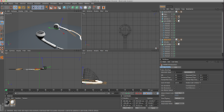
To Start with I added a circle with the circle tool. Then I kept duplicating it and I change the shape and possition each time to make it into the shape of the top of a headphone. I did this while looking at all the different angles to get the shape right. Once I'd done that I added a Loft NURBS. Then put the all the circle into the Loft NURB this joined up all the circles and made them soild.


To make the wire I had to use the ... tool to draw a line. Then I added a circle to the top of the wire. After that I put it into a Sweep NURB this created a long wire shape. I had to resize it and fit it into the top of the headphone. I also added a cyclider on the top of the headphone so I could add a speaker texture. I made a new material and got a picture off the internet to add to the cyclinder.
I also duplicated the headphone top and did a new wire for that one. I add white colour to the headphones and the wires.


Bear

I know for my final project I would like to build a character so I practised making something very simple just by adding lots of sphere's together and shaping them.